Connecting aspiring writers and editors
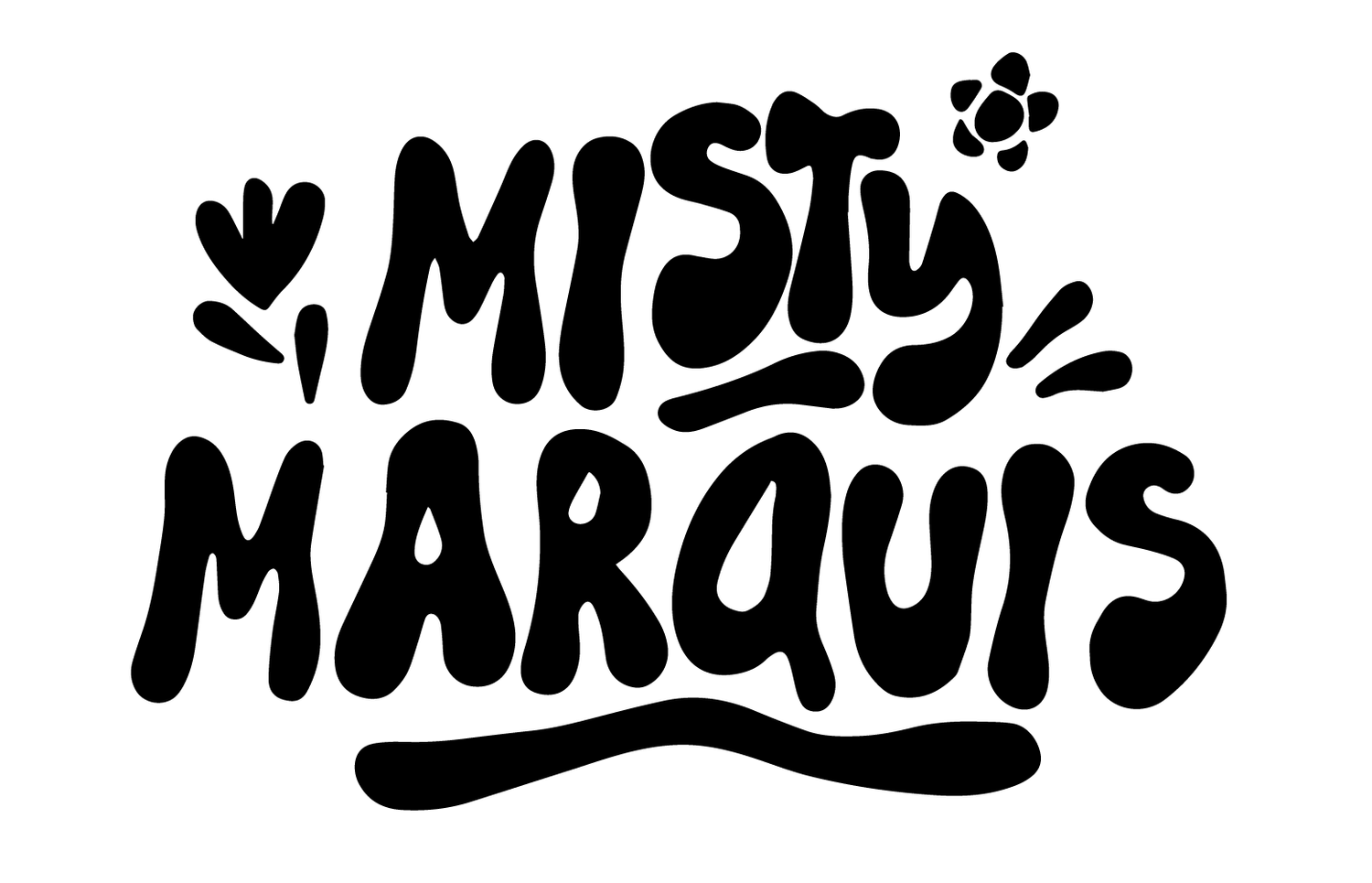
*Above - ADLOB (Ad Like Object) by Misty Marquis
TEAM
Misty Marquis, Design Lead (UX/UI)
Mary Surivong, UX/UI Designer
Chris Schell, UX Designer
MY CONTRIBUTIONS
Design Lead
Prototyping
Wireframes
Creative Strategy
Brand Strategy
CONSTRAINTS
iOS, Mobile / Responsive Web, Desktop
TIMELINE
4 weeks, Agile Workflow
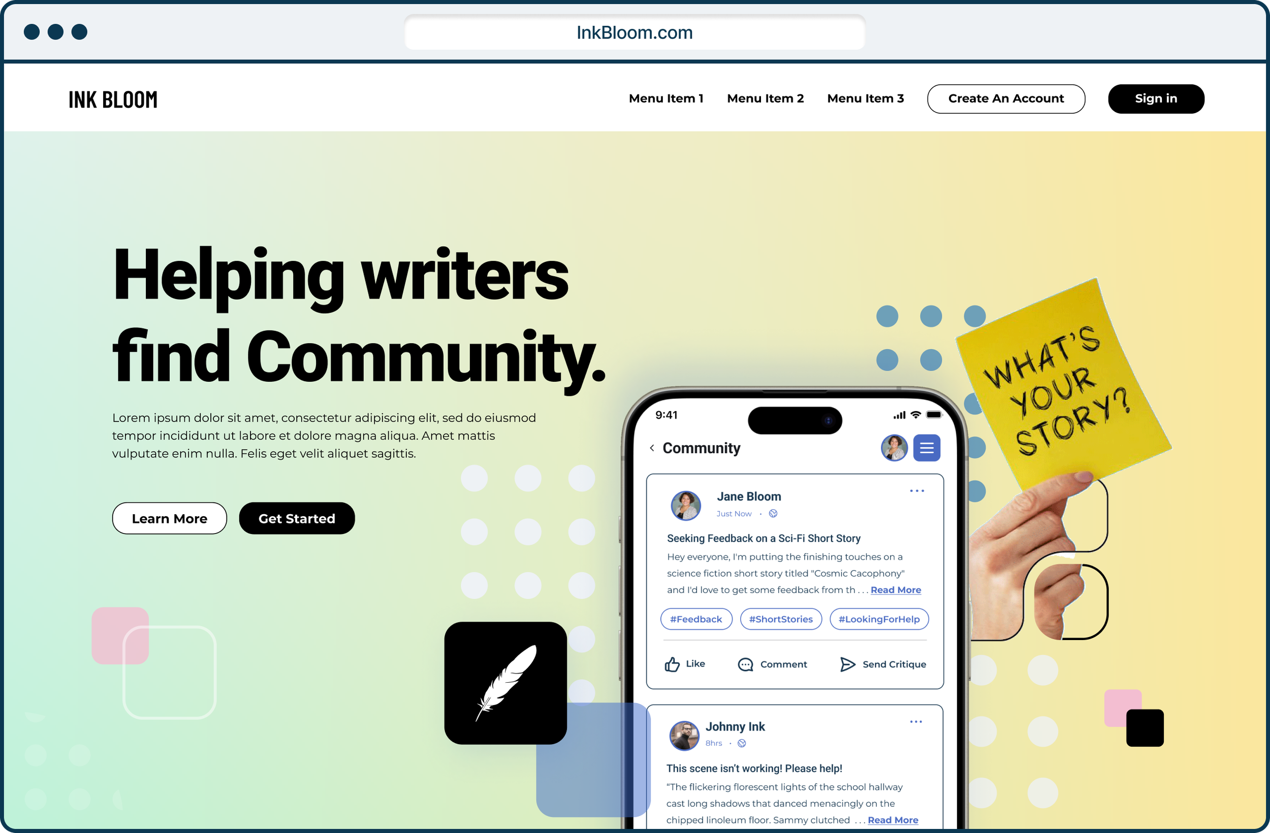
Project Overview
InkBloom is more than a writing platform—it’s a thriving community where writers of all levels come together to learn, create, and grow. Founded by Dr. Ray Hsu, Ph.D. (University of Wisconsin–Madison) and former faculty member at the University of British Columbia, the project builds on his experience leading educational innovation at the intersection of media, technology, and social impact.
As the lead designer, I collaborated with Dr. Hsu to translate his vision into a robust prototype aimed at connecting aspiring writers with mentors and coaches who can help them reach their goals. My focus was on crafting an intuitive, inspiring experience that fosters community, creativity, and growth—laying the groundwork for a product ready to attract investors and move toward market launch.

The Challenge
While the client’s vision for InkBloom was clear — develop a feature-rich prototype ready to present to investors and developers — our discovery process revealed a need to first establish a strong product foundation.
The challenge lay in aligning expectations around scope, strategy, and design priorities to ensure the platform could scale successfully. My role was to help define the core user experience, clarify the product’s positioning, and create a prototype that not only demonstrated functionality but also captured the emotional essence of the community InkBloom aims to foster.
Process
To bring InkBloom’s vision to life, I took a user-centered design approach that balanced strategic planning with creative exploration. The process began with stakeholder interviews and competitive research to identify gaps in the market and understand the needs of both aspiring writers and experienced mentors. From there, I developed user flows, wireframes, and interactive prototypes, iterating closely with the client to ensure the experience was intuitive, engaging, and aligned with the platform’s mission. Throughout the project, my focus remained on creating a product that not only demonstrated functional value for investors but also captured the emotional connection and sense of community at the heart of InkBloom.
Additional key items missing from the previous team’s work:
Site Map
User Stories
Journey Map
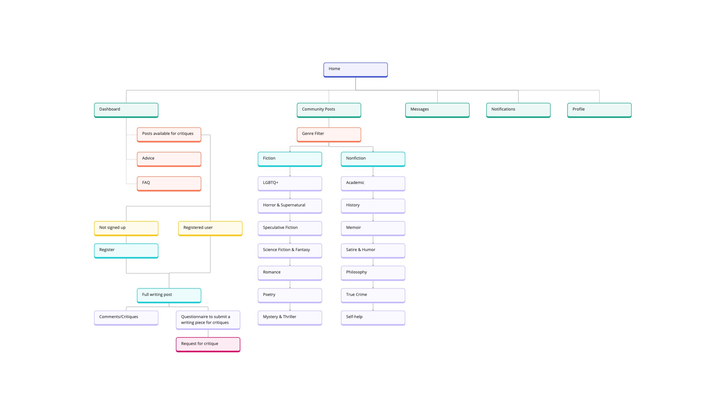
Site Map

Journey Map

Heuristic Evaluation of 1st Phase of Product Development


In addition to addressing the product’s structure (IA), we needed to enhance the visual aesthetics as well as incorporate a few essential features.
Competitor Analysis

NOTE: Medium and LinkedIn, two writing and networking platforms that shared key features. Features such as: the ability to react to stories, bookmark, follow, and direct message individuals within the platforms. Which were key features missing from Ink Bloom.

Additional notes from product assessment:
User Flow - There does not appear to be any clear visual hierarchy, information is scattered, and Red Route(s) is not clearly defined
Error prevention - is not recognized, or there are not any clear safeguards in place
User Control & Freedom - users need a clearly marked “emergency exit” as they are navigating through the app in case they make a mistake or need to go back to the previous screen.
Revised Wireframes
Mobile
Desktop

Visual Design Direction
Solution & Outcome
The final prototype successfully translated the client’s vision into a tangible, interactive experience.
Key features included
Intuitive onboarding
mentor-mentee matching
community-driven collaboration tools
All designed to foster connection and growth among writers of all levels. By focusing on usability, visual clarity, and emotional engagement, the prototype clearly communicated the platform’s value to investors and developers, setting the stage for future production and market launch.
Through this project, I was able to showcase how thoughtful design can bridge vision and execution—creating a product that not only meets functional goals but also inspires and empowers its users.

“Visually aesthetic designs use consistent typography, establish a clear hierarchy, utilize a refined color palette, and align to a grid.”
— Nielsen Norman