Carve
the Atmosphere
ROLE
Creative Direction & Design
CLIENT
Comet Skateboards
MY CONTRIBUTION
Brand ID & Visual Design
Product Design
Copywriting
Illustration
Web Design
Project Overview
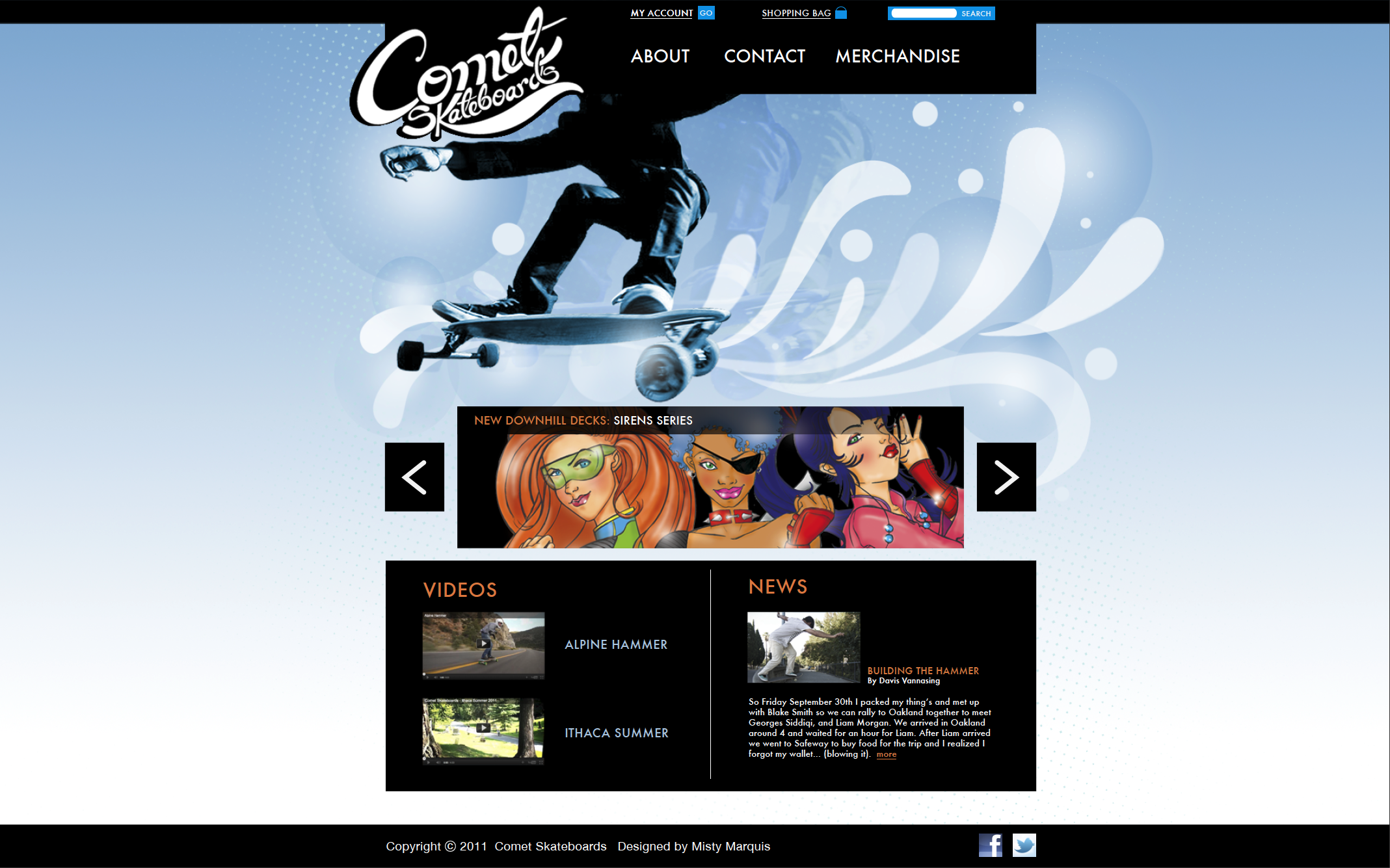
Comet Skateboards is a New York-based company that embraces a community-driven design process. Riders are invited to contribute to the development of skateboard shapes, graphics, and occasionally even product names. By maintaining constant communication with skaters of all levels, Comet has cultivated a diverse lineup of decks—from street to downhill and everything in between. This collaborative approach ensures that each product reflects the needs, style, and creativity of the skateboarding community.
Old Logo
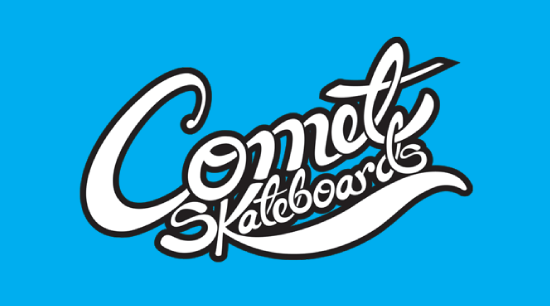
New Logo
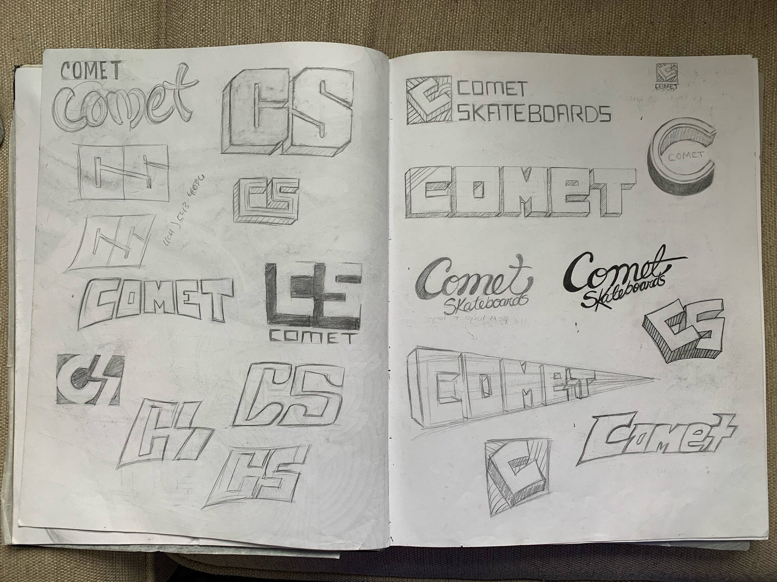
Logo Exploration
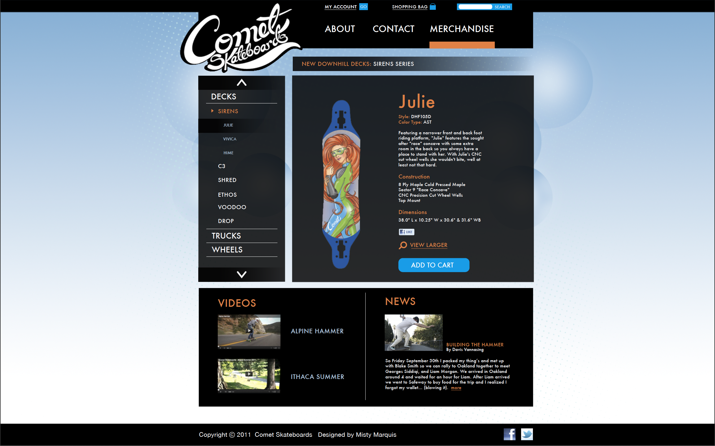
Deck graphic
Developing a brand that’s rad
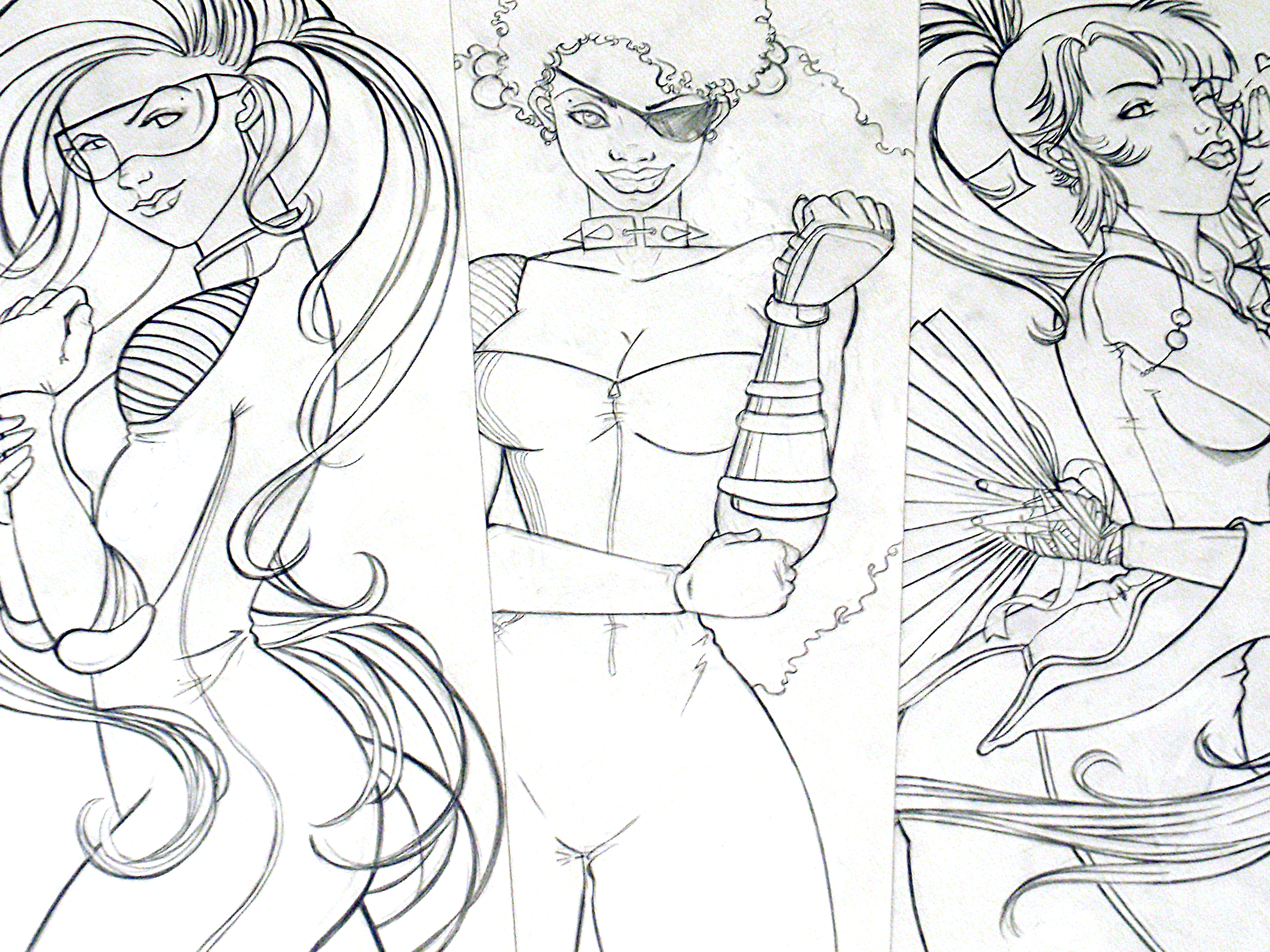
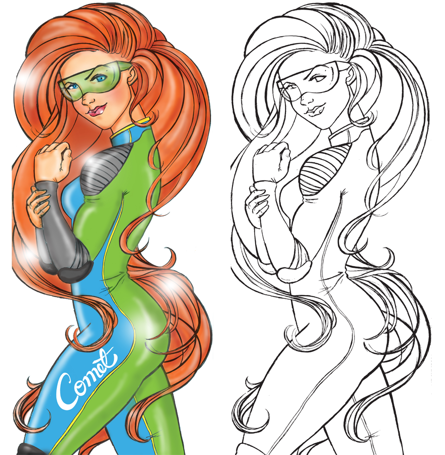
Although Comet had a unique product approach, their original brand was generic and visually unsafe, resembling another mark in the industry. I led the redesign, creating a new logo, slogan—Carve the Atmosphere—and brand messaging that captured Comet’s energy and ethos. To celebrate the refresh, I also designed three special “Sirens” character decks aimed at engaging female skateboarders and expanding the brand’s reach.
Challenge
Create a distinct, authentic brand identity for Comet that reflects its community-driven product approach, energizes its audience, and differentiates it in a crowded market.
Outcome
Delivered a fresh, memorable brand identity and community-driven product lineup, expanding Comet’s appeal—including reaching the female skateboarding market—and reinforcing its position as a dynamic, rider-focused skate brand.
Process
Redesigned the logo and developed the slogan Carve the Atmosphere to capture the brand’s attitude.
Led creative direction and design of decks, including collaborative community-driven graphics and the special “Sirens” character decks.
Integrated rider feedback into the design process to maintain authenticity and inclusivity across the product line.